
Automate Your Sensitivity Analysis with TruSens
Sensitivity analysis In Excel can be time consuming and cumbersome. TruSens makes it easy by automating five (5) different sensitivity reports. For any complex decision analysis there are many variables that may change, possibly having an adverse effect on a given project or investment. How does a rise in interest rates affect my project’s value? At what rate does it make sense to scrap it? Or to invest more? Sensitivity analysis helps you answer these important questions. And TruSens makes sensitivity analysis easy!
Save Money with the PRO Combo!
SolutionTree PRO
The Pro version includes a full-featured version of TruSens, all under a single tab in the Excel Ribbon. And you’ll save money!
Overview
Sensitivity analysis is an important part of many quantitative decisions. TruSens makes it easy by automating the five (5) major report types — tornado charts, spider charts, strategy region graphs, two-variable 3D charts, and two-variable strategy tables.
- 100% Excel Functionality
- Each Report Includes Chart and Data Table
- Inputs can Easily be Saved and Re-Loaded
- Works Seamlessly with SolutionTree
- And Much More!
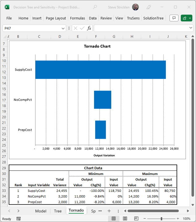
Even Tornado Charts are a Breeze!
TruSens Features
TruSens works seamlessly with Microsoft Excel. It can be used with or without SolutionTree to automate your sensitivity analysis.
This is a favorite among decision analysts, but one of the most difficult to implement. Horizontal bars are used to show the relative impact of each independent variable and, because they're ranked from top to bottom, the chart resembles a tornado.
Spider charts also shows the relative sensitivities of multiple variables from a single dependent variable. In this case, however, the values on both axes of the chart are depicted as percentage values using line graphs, resembling the legs of a spider.
This chart is used to visualize the impact that a single independent variable has on one or more dependent variables. The dependent variables are typically mutually exclusive options. Usually, multiple dependent variables are graphed relative to each other, revealing the strategic regions for each option.
Surface charts and the 3D-column charts are used with two-variable sensitivities, i.e. two independent variables and a single dependent variable. The only difference is the chart type used. Sometimes a surface chart will let you visualize the data better, and sometimes a 3D column will. Use both to get a different look on the same output.
This report is unique among the TruSens reports in that it is not a chart. It not only measures the sensitivity of multiple dependent variables as two independent variables are adjusted, it tells you what the best option is under any of the scenarios. Usually, the dependent variables are mutually exclusive options and you are trying to determine which option is best assuming different combinations of the two independent variables.
Excel Add-ins FAQs
Our add-ins work with Microsoft Excel 2007 or later (on Windows)
No, our add-ins work only on Windows.
Sensitivity Analysis Examples
- Project Bidding
- Oil Drilling

100% Satisfaction Guarantee!
If you're not completely satisfied with our Excel Add-ins within 30 days of purchase, you'll get a full refund.
Questions about our Excel Add-Ins?
Let us know how we can help. We’ll get in touch within one business day.
